[box color=”orange”]
UPDATE!
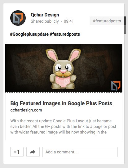
We’ve been finally provided with official guidelines for rendering full-bleed image and a description, when sharing on Google+.
[/box]
With this update Google Plus Layout just became even better. All the G+ posts with the link to a page or post with wider featured image will be now showing in the Google Plus stream with a centered, larger image and bigger page title. It’s almost like an early Easter present from Google.
Requirements Summary (Credit to Mike Alton and his great article regarding the guidelines):
- Width: min 506px (that has been changed to min 400px in the official Google requirement article)
- Aspect Ratio: max 5:2
- Displayed Height: max 303px
- Open Graph or Schema.org Content Type tag
- Open Graph or Schema.org Image tag
- Open Graph or Schema.org Title tag
- Open Graph or Schema.org Description tag
New Shared Link Post Layout

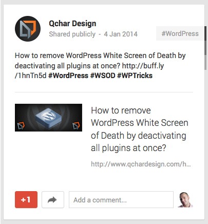
Old Shared Link Post Layout

That’s definitely the way forward and hopefully it will bring more creativity in to Google Plus blogging and maybe more designers and creative people will be interested in to Google Plus platform.
There is however another part of this story. In this new layout, both website link and photo link have been assigned with rel=”nofollow” attributes. It means that no link juice will be added to linked page/post and sharing it on Google Plus will not influence the link target’s ranking in search engine’s index. We can hope that it will at least stop some spammers from links dumping on G+.
[box color=”orange”] If you find this article helpful, please share it with the links below. [/box]

